California Psychics
Contact Us & Help Center Redesign V2

The Goal
Simplify the web interface and make all support contact options clear, in one centralized location.
Create one navigation point that directs users to the “Contact Us” page.
Highlight and push the CS form so users can submit their inquiries and the requests will go to customer service for their internal log.
Timeline & Platform
August 2022 - October 2022
Responsive Web
Overview
The Challenge
Team
California Psychics is a B2C platform of online psychics dedicated to helping users connect and ask questions to live to their full potential. The customer service department highlighted numerous pain points for customers in the help center site and requested changes be made to help users find an easier way to contact their team.
Users cannot reach the customer service department efficiently. With many entry points and lack of hierarchy on the current page, users are left feeling disgruntled and often do not complete their transactions.
UX Designer
QA Team
Offshore and Internal Developers
Data Analysts
Project Managers
Customer Service Department
My Role
UX Designer
Research & Synthesis

User Flow
I created visuals of the current user flows of both desktop and mobile to help stakeholders see the issues that users were currently facing.
Current Desktop Flow

Current Mobile Flow
Proposed User Flow
User Data
After organizing the data from the Voice of Customer requests and information given by the CS Department, I concluded that:
• Users click the customer service button expecting to talk to a psychic and become disgruntled by having to contact a psychic separately.
• The customer service department expends manpower dealing with these calls.
• Users call instead of sending in the form that CS team would like to push so they have an internal log for training purposes.


The proposed user flow was optimized to encourage user engagement with the CS form. The CS form allows responses to be logged for training purposes.

Competitive Analysis
What do most contact pages have in common? What do we need?
I conducted a competitor analysis using an affinity map to illustrate what other companies provide to their clients and what clients typically expect in their help department.
Insights
While some competitors featured an advisors section, it was neither prevalent nor deemed necessary within California Psychics’ scope. Other recurrent themes included:
• Live Help or Support
• FAQ Section with Common Questions
• Search Bar
• Request or Contact Us Form
• Related Helpful Articles
Proposed Features
After research and synthesizing, the project manager and I presented to the stakeholders and the internal teams (customer service department, product team, data analysts, and tech department) our proposed features that aligned with the
project goals.
#1 Highlight the form
Highlighting a newly designed form where users can submit their inquiries and customer service can create a backlog for future training purposes.
#2 Create additional support / help center
Establish an independent, self-sustaining Help Center page featuring FAQs, informative articles, and a search bar to assist users.
#3 Simplify the phone contacts
Create a simpler way to showcase the many countries the company offers help lines in, especially on mobile where the endless scrolling caused issues.
Brand Identity
By utilizing the existing style guide and component library that was created by the creative team in their brand refresh, I used the color palette, fonts, and illustration styles throughout the new design.
I wanted to ensure that the brand identity would be consistent with the other pages across mobile web and desktop.
Taking It From Old to New - Desktop
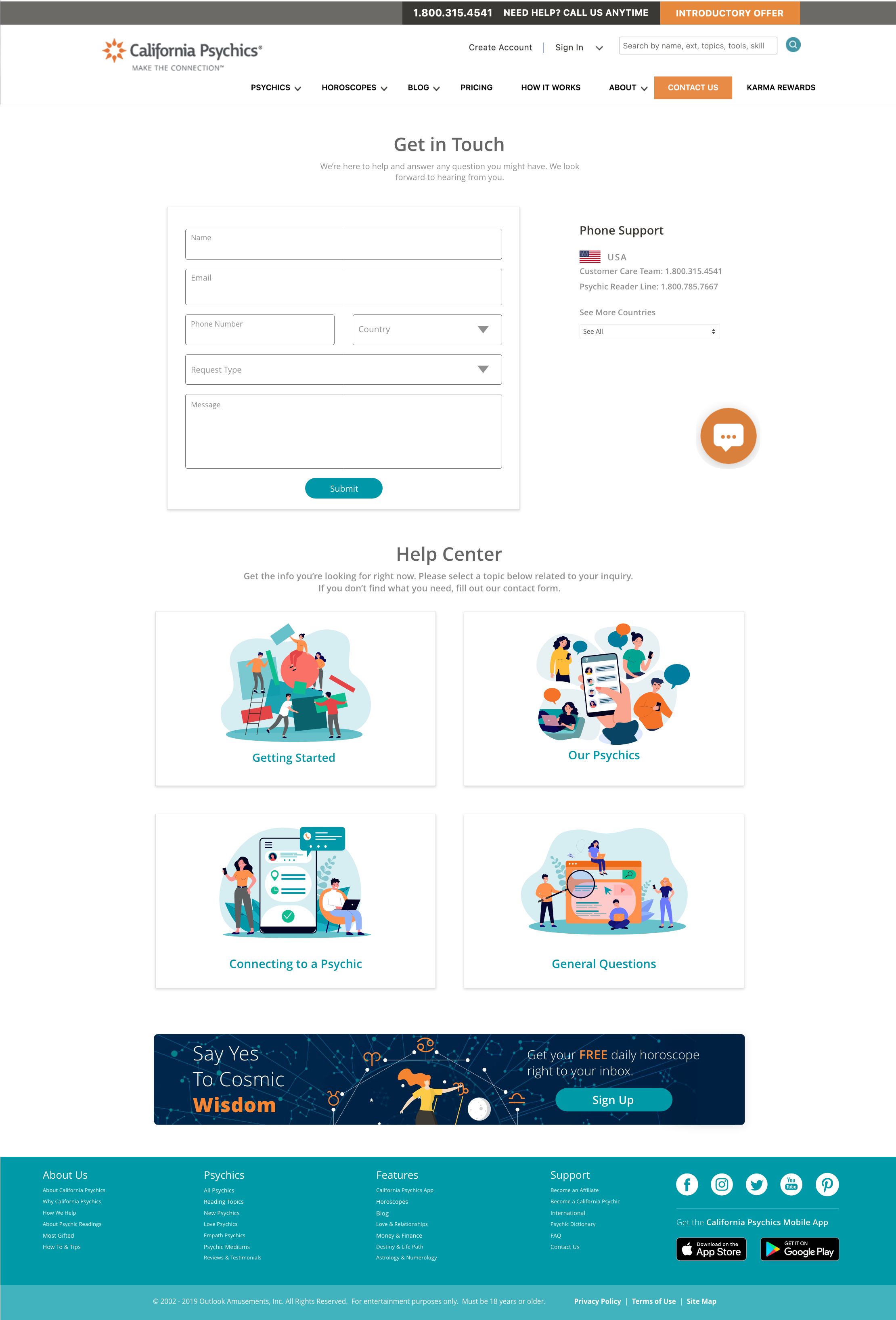
Old “Contact Us” Page - Desktop
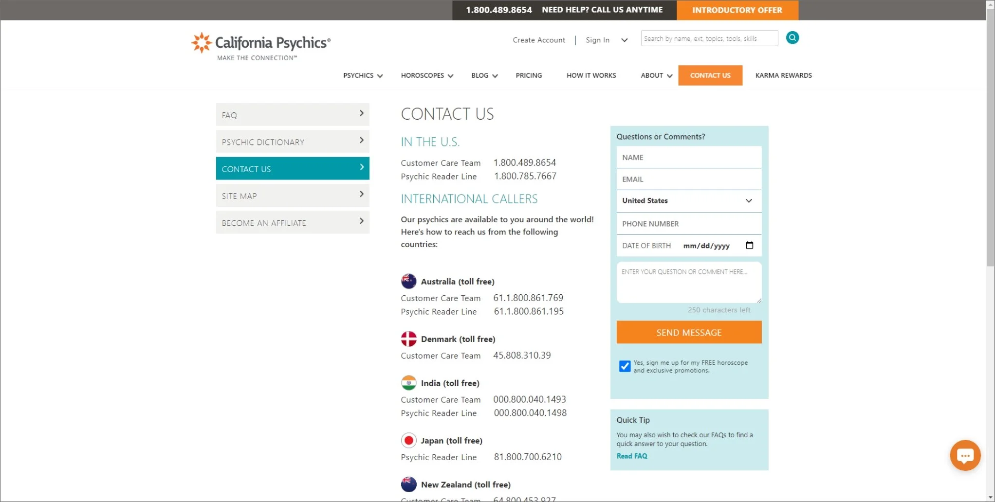

Following research and interviews with the customer service department and data analysts, the suggested “Contact Us” page centers on key goals established and agreed upon by stakeholders and internal teams:
• The proposed page features a streamlined phone support section with a dropdown for other countries.
• The form is immediately visible on the “Contact Us” page, eliminating the need for scrolling.
• The phone icon is replaced with a question mark that directs users to the “Contact Us” page.
• Introduction of a newly created “Help Center” containing articles and FAQs.
Taking It From Old to New - Bio Page
Old FAQ Page - Desktop


Old “Contact Us” Page - Mobile Web

The former “Contact Us” page was cluttered, causing user dissatisfaction with its confusing layout and suboptimal hierarchy, especially on mobile devices. The “Read FAQ” and side menu FAQ buttons redirected users to a page under “About Us” instead of “Contact Us,” leading to concerns and disruptions.
Additionally, on mobile web, the top-right green button with a phone icon confused users as it directed them to the ‘Contact Us’ page instead of initiating a call to a psychic or help line.
Proposed Mobile “Contact Us” Page
Old Psychic Bio Page - Mobile Web


This button led users to
think that they were reaching a psychic, only to be led to the contact us page.
This chat button which is the live chat support confused users when they were led to chat with customer support instead of a psychic, leading to many missed transactions.


Proposed Desktop “Contact Us” Page

Old Psychic Bio Page - Mobile Web


Clearer iconography to let users know what the button would do.
Verbiage with CTAs and hiding the live chat widget to make clear to users.
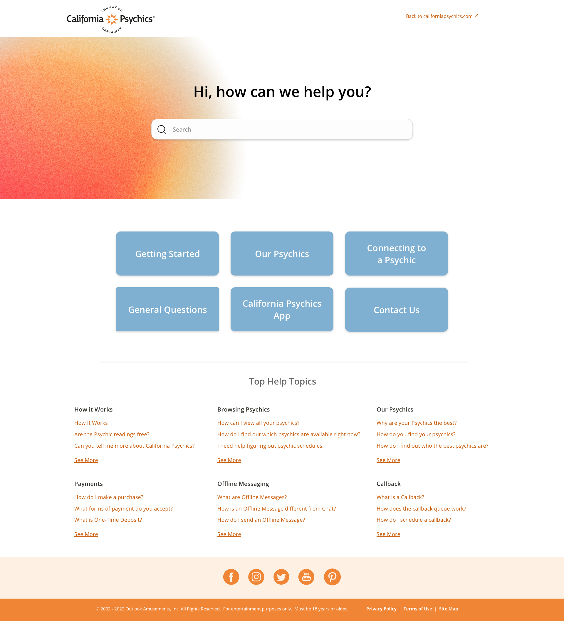
Establishing a Help Center
• Measure how many users utilize this page. KPIs will be measured by the number of views and clicks on the form and Help Center categories.
* As of 01/2023, the page had been monitored for the previous 3 months and had been viewed over 31,000 times with 23,975 unique page views. Data Analyst team informed us that the traffic was consistent with positive usage of the CS form.


• Conduct future user research with Customer Service to confirm if the form is providing them enough support for their training logs.
Next Steps
I implemented a self-sufficient and robust Help Center page using Zendesk, containing articles designed to guide users, accessible through links from the Contact Us page’s Help Center articles.
* The CP Help Center had been built in the following sprint to accommodate the changes in the Contact Us page. It has since had over 4,000 views and the top three clicked on has been the “How it Works,” “Offline Messaging,” and “Payments” sections.